Tempo
course project / 7 weeks
- a mobile app for BC* Permanent Residents at the beginning of their house-seeking process to find temporary housing in lifestyle-suitable neighbourhoods*This is a hypothetical intervention designed for an academic project and is not affiliated with Canada or British Columbia's immigration services in any way.
View Final Slide Deck (PDF)
Download Keynote
00. Challenging Transitions
Tempo was designed with the intent to ease the uncertainty that immigrants experience when searching for a new home in an unfamiliar city. It allows immigrants to explore their new home city and discover homes in neighbourhoods that suit their lifestyle needs.
01. Objective
Create an interactive digital experience that caters to a specific domain and context.
I was the art director and interactive prototyper, with supporting roles in UX research and UI design. I was responsible for visually establishing trust + reliability, designing two major app features, and the content formatting of Tempo's onboarding quiz. In addition, I oversaw the development of all major workflows.
02. Insights
To start, my team and I conducted user interviews to gain insight to the experiences behind immigrating to Canada. We also conducted secondary research on existing programs, laws, and rental apps. I was responsible for looking into rental policies and laws, which can differ per city or province — ultimately helping to determine feasibility and scope.
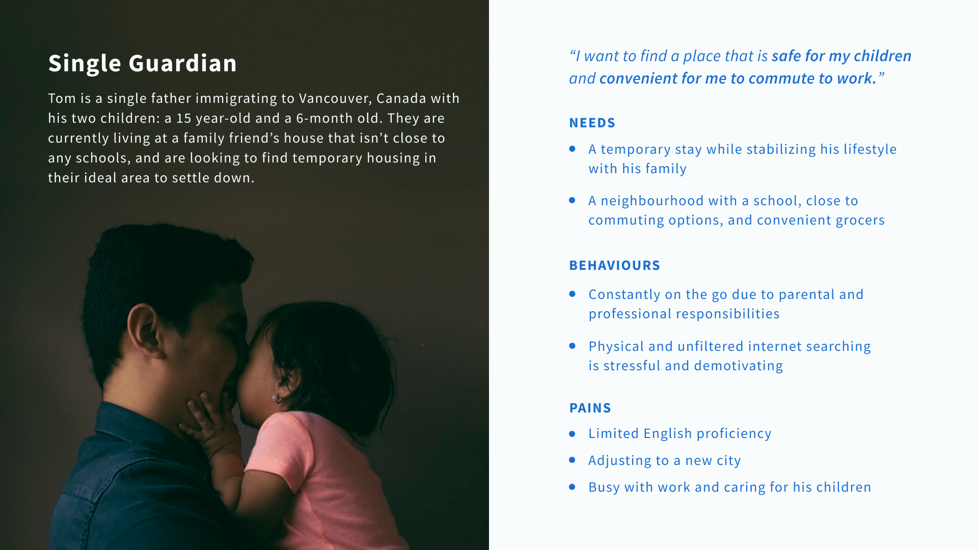
The information we gathered allowed us to create our persona, Tom:
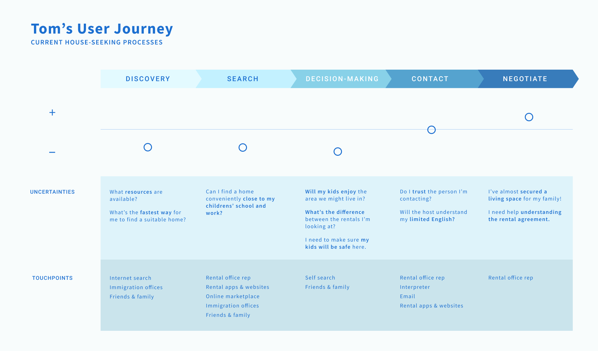
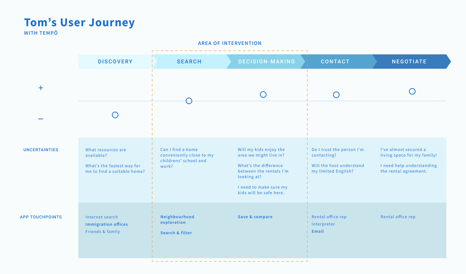
User journey maps helped us to better understand where Tempo could improve current frictions in the house-seeking process — particularly in the areas of discovery and search.
03. Final Outcome
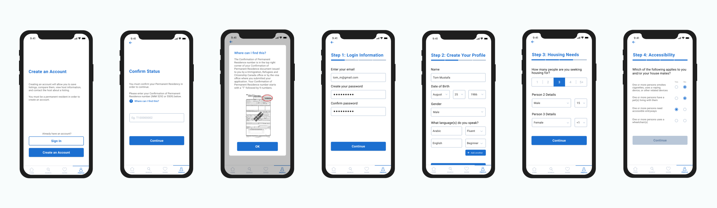
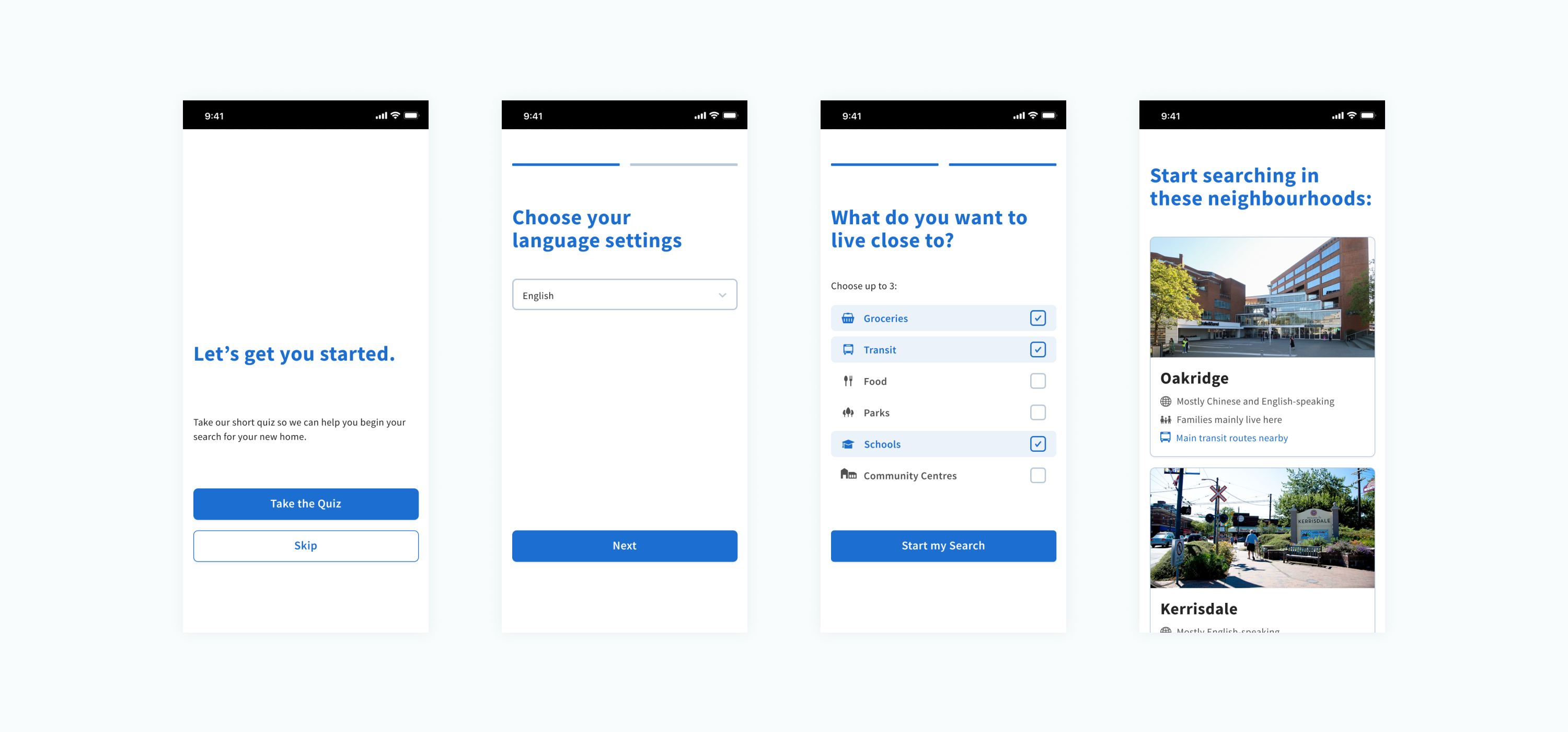
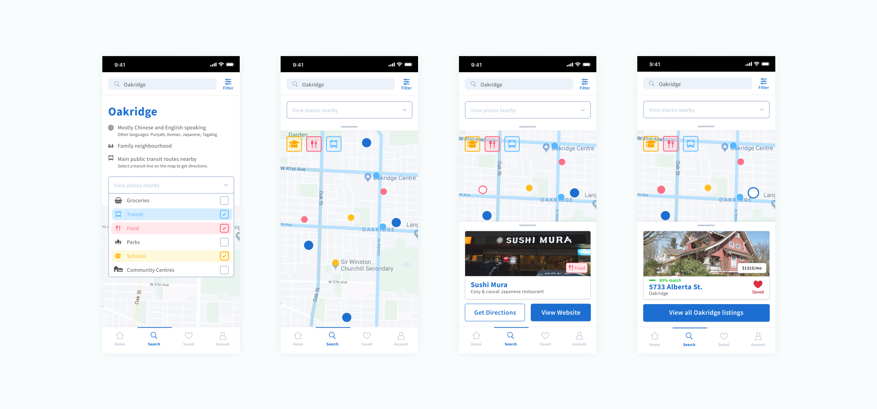
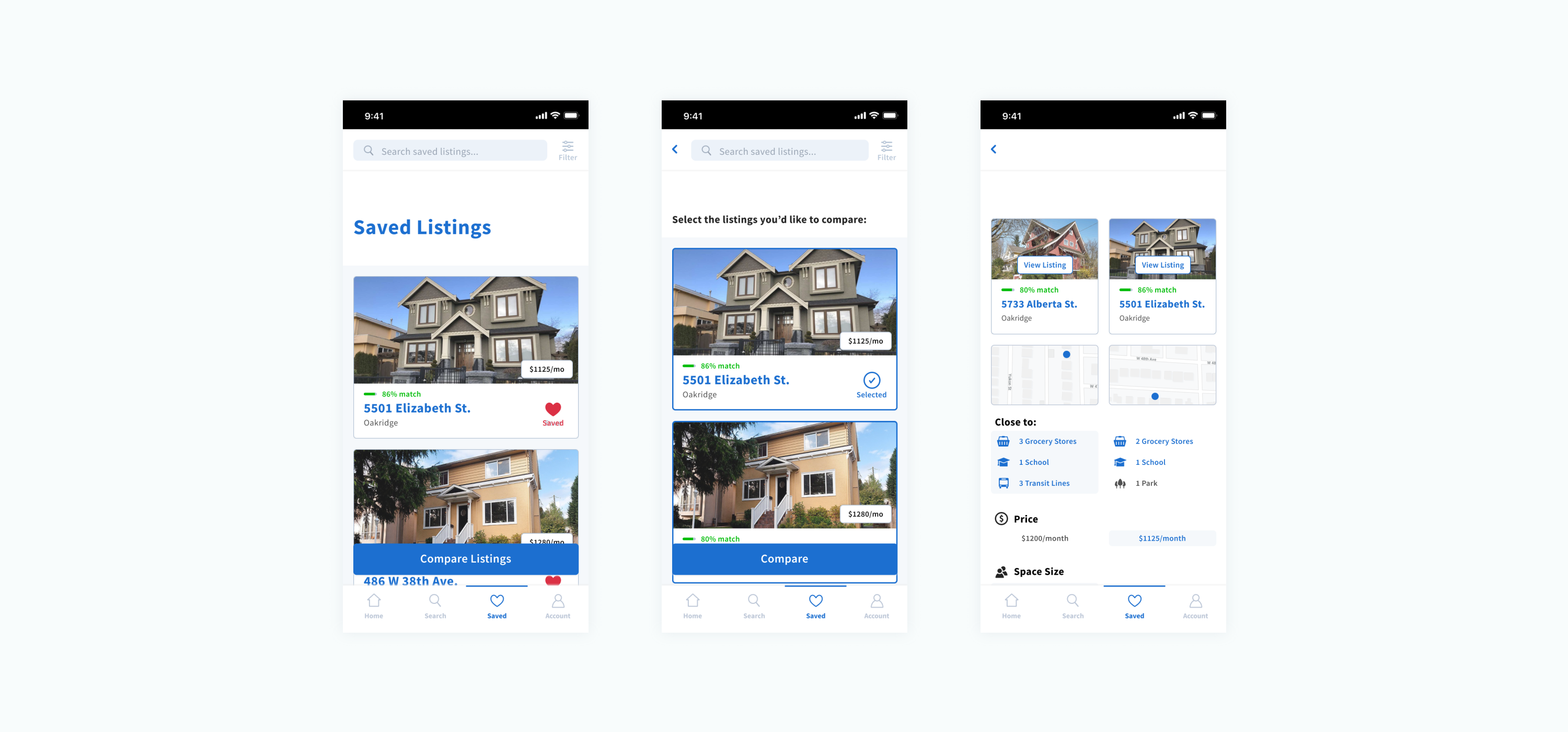
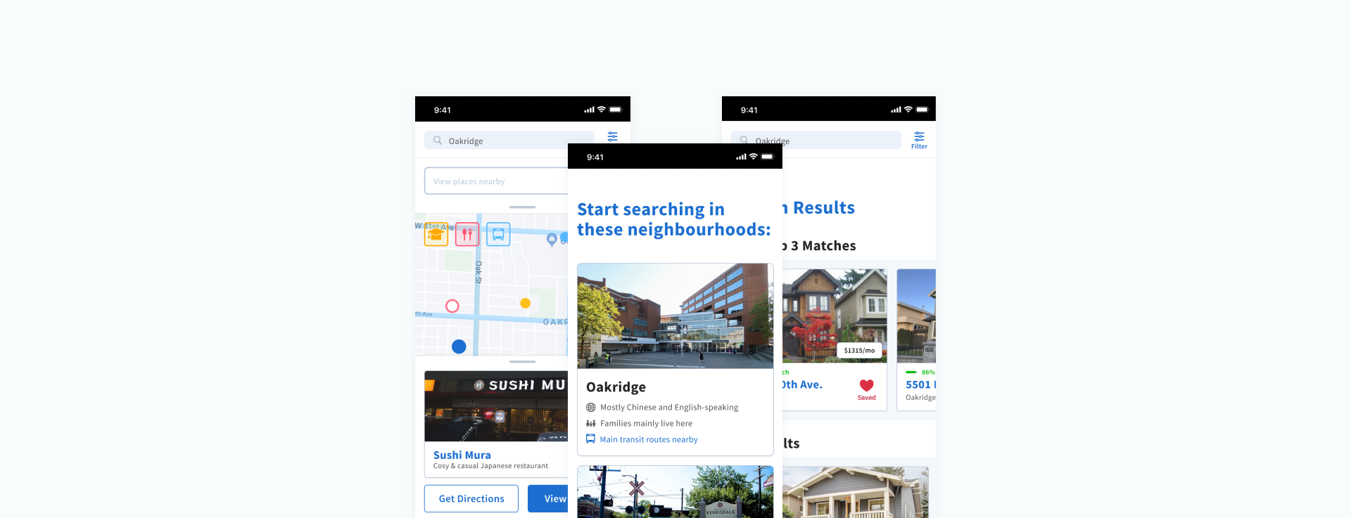
In prototyping, I prioritized straightforward interactions that required less back-and-forth between screens to promote clarity in a space saturated with information. Here, I provided feedback and suggestions to various members of the team to bring these interactions to life.
We were praised by the teaching team on how streamlined Tempo's functionality appeared, and on the uniqueness of the neighbourhood exploration feature.
04. Takeaways
For my first academic interaction design project, there was definitely a steep learning curve, especially with the context my team and I chose to design for. I was also learning prototyping tools on the go.
I've also come to realize how much thought goes into designing information filtering for maps, and have a newfound appreciation for how seamless of an experience it can be.